Bivariate statistics or two variable statistics is a type of inferential statistics that deals with the relationship between two variables (e.g., price and demand). Bivariate statistics examines how one variable compares with or influences another variable (e.g., how price can drive demand). A correlation coefficient or a regression model can be used to quantify the association between the two variables. This post constitutes Lesson 7 of the Basic Statistics Mini-Course.
You may also be interested in Normal approximation to the binomial distribution.
Key concepts covered in this post: scatterplots, correlation, line of best fit, curve of best fit.
Scatterplots
A scatterplot is a type of mathematical diagram plotted using Cartesian coordinates (x,y) to display values for two numerical variables for a set of data to help visualize a relationship between the variables.
A scatter diagram (also known as scatter plot, scatter graph, and correlation chart) is a tool for analyzing relationships between two variables for determining how closely the two variables are related. One variable is plotted on the horizontal axis and the other is plotted on the vertical axis. The pattern of their intersecting points can graphically show relationship patterns. (Visual Paradigm, 2022)
Example 1: A high school tutoring company collected the following data for 20 students who were failing in math. Display the data in a scatterplot and comment on the graph.
| Hours spent studying | Mark |
|---|---|
| 5 | 65 |
| 7 | 72 |
| 3 | 56 |
| 12 | 80 |
| 9 | 75 |
| 12 | 74 |
| 10 | 74 |
| 8 | 75 |
| 5 | 58 |
| 1 | 51 |
| 7 | 62 |
| 13 | 83 |
| 10 | 80 |
| 3 | 61 |
| 7 | 67 |
| 20 | 93 |
| 18 | 82 |
| 15 | 85 |
| 8 | 70 |
| 6 | 65 |
The data plot below shows an up trend and to the right. The points cluster about a line with a positive slope indicating that the variables are positively correlated. The shape of the graph suggests that students perform better in math the more hours they spend studying. But this is not necessarily indicative of a causal relationship. Think about it!

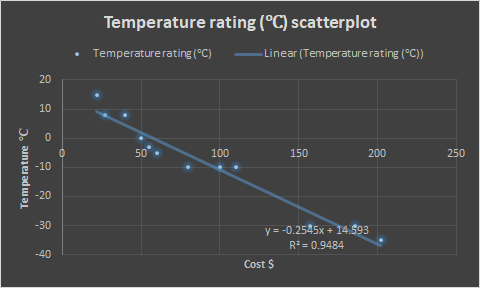
Example 2: A camp outfitter sells 12 different sleeping bags as follows. Display the data in a scatterplot. Do you notice a pattern?
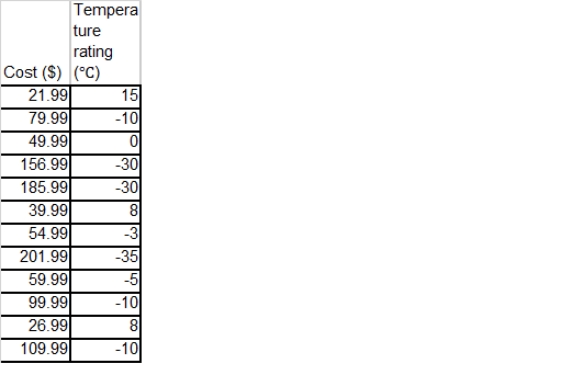
The points show a trend downwards and to the right, clustering around a line with a negative slope (see the graph below created with Microsoft Excel). There is a negative correlation between the temperature rating and the cost of the bags. And since a bag to resist colder temperatures probably needs more fill or a more costly type of fill, we can hypothesize a causal relationship between the two variables.
Correlation
Scatterplots require pairs of data, one set of data in the pair is referred to as the Independent Variable (X). The second half of the data set, the observed measurement, is the Dependent Variable (Y). The relationship between the two variables can be positive, negative or non-existent (CQE Academy, 2021).
The correlation is positive if one variable increases as the other increases. The correlation is negative if one variable decreases as the other increases. No Correlation exists when the two variables have no measurable effect on each other, i.e., a change in X, does not impact Y (CQE Academy, 2021).
The strength of the relationship between two variables can be analyzed visually by how closely the points fall on a line of best fit (how closely packed the points are to each other on a graph). It can be expressed mathematically using the Pearson Correlation Coefficient (R or r), which is a number that ranges from a strong positive correlation (+1) to a strong negative correlation (-1) (CQE Academy, 2021).
“Data that tightly hugs the line or curve of best fit shows a strong correlation. Data that clusters loosely around the line or curve displays a weak correlation” (Sinclair, 1999). “Points that end up far outside the general cluster of points are known as outliers” (CQE Academy, 2021).
You may be interested in How to compute Pearson’s R by hand, in Excel, in SPSS, and in Minitab – by Statistics How To
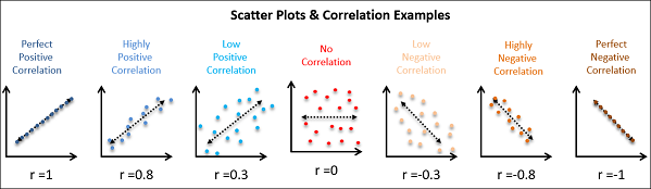
Source (the above graph): CQE Academy (2021)
Variables can show a correlation even though there is no causal relationship between them.
Line of best fit
A scatterplot that shows a strong negative or positive correlation between two variables in a causal relationship can be used to predict the value of one of the variables through interpolation.
A prediction can be made based on a line drawn through the cluster of points, a line of best fit.
Traditionally an eyeball-fit line is hand-drawn through a scatterplot such that the line lies on as many points as possible, and half the points lie above the line and half below the line.
The line can be expressed by a mathematical equation: y = mx + b; where b = y intercept; and m is the slope of the line.
m =y-y1/x-x1= change in y/change in x.
The least squares line or the regression line is an effective way to plot a line of best fit, “based on the idea that if we calculate the squares of the vertical distances from the data points to a particular line and add them up, the sum should be as small as possible” (Sinclair, 1999).
Simple linear regression or ordinary least squares (OLS) regression is a tool commonly used in forecasting and financial analysis.
From the sleeping bag scatterplot (Example 2) we might conclude by interpolation that a bag to withstand temperatures of -40℃ will cost around $225.
Excel has computed the line of best fit and the equation of the line for us: y = -0.2545x + 14.593. Excel has also computed the coefficient of determination R2 = 0.9484.
R2 is a goodness-of-fit measure for linear regression models. R-squared “explains to what extent the variance of one variable explains the variance of the second variable. So, if the R2 of a model is 0.50, then approximately half of the observed variation can be explained by the model’s inputs” (The Investopedia Team, 2022).
R-squared “is represented as a value between 0.0 and 1.0, where a value of 1.0 indicates a perfect fit, and is thus a highly reliable model for future forecasts, while a value of 0.0 would indicate that the model fails to accurately model the data at all” (Bloomenthal, 2020). R-squared values are commonly stated as percentages from 0 to 100, with 100 signaling perfect correlation and zero no correlation at all.
In general, the higher the R-squared, the better the model fits the data. However, there are important considerations in this regard. Adjusted R-squared and predicted R-squared are two measures that provide additional information by which we can evaluate a regression model’s explanatory power (e.g., see here).
“Adding more independent variables or predictors to a regression model tends to increase the R-squared value, which tempts makers of the model to add even more variables. This is called overfitting.” Adjusted R-squared is used to determine the reliability of a correlation and how much it is determined by the addition of independent variables (The Investopedia Team, 2022).
This adjustment can provide an accurate model that fits the current data. In comparison, the predicted R-squared is used to determine how well a regression model predicts responses for new observations (how likely it is that it will be accurate for future data) (The Investopedia Team, 2022).
In the short video “Least Squares Linear Regression – EXCEL,” Cody Tabbert (2013) walks us through an example of “how to get the Linear Regression Line (equation) and then the scatter plot with the line on it”; and how to compute the sum of the squared residuals using Microsoft Excel.
To do least squares regression old school, grab a copy of Edwards’ (1954) Statistical Methods for the Behavioral Sciences” and practice the example on page 121.
Curve of best fit
Sometimes a curve of best fit may summarize data better than a line of best fit.
y = mx + b describes a linear function where for each input of x, we get one output for y. The graph of these functions is a single straight line.
A quadratic function has the form y = ax2 + bx + c. For each output for y, there can be up to two associated input values of x. The graph of these functions is a parabola (parabolic) – a smooth u- or n-shaped curve.
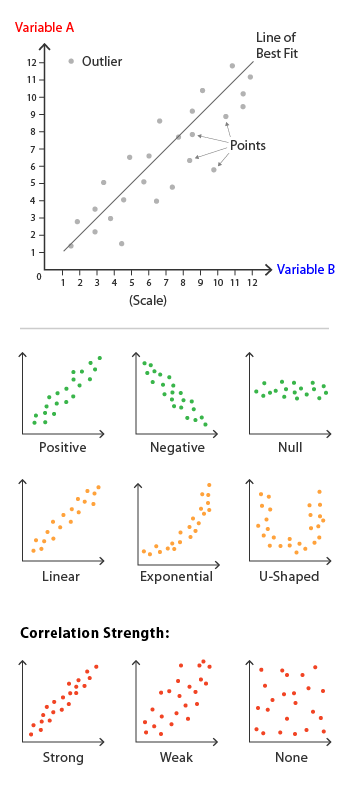
Source (the above graph): The Data Visualisation Catalogue (n. d.)
Key references
Bloomenthal, Andrew. (2020, July 14). Coefficient of Determination. Investopedia. https://www.investopedia.com/terms/c/coefficient-of-determination.asp
CQE Academy. (2021). Quality Control Tools. cqeacademy.com/cqe-body-of-knowledge/continuous-improvement/quality-control-tools/
Sinclair, Margaret. (1999). How to Get an A in: Statistics & Data Analysis. Coles Publishing, Toronto.
The Data Visualisation Catalogue. (n. d.). Scatterplot. https://datavizcatalogue.com/methods/scatterplot.html
The Investopedia Team. (2022, February 11). R-Squared vs. Adjusted R-Squared: What’s the Difference? https://www.investopedia.com/ask/answers/012615/whats-difference-between-rsquared-and-adjusted-rsquared.asp
Visual Paradigm. (2022). What is a Scatter Diagram? https://online.visual-paradigm.com/knowledge/data-visualization/what-is-scatter-diagram/
Back to Basic Statistics Mini-Course
Back to DTI Courses
Related content
Data presentation in statistics
Normal approximation to the binomial distribution
Normal distribution or Gaussian distribution
Other content
1st Annual University of Ottawa Supervisor Bullying ESG Business Risk Assessment Briefing
Disgraced uOttawa President Jacques Frémont ignores bullying problem
How to end supervisor bullying at uOttawa
PhD in DTI uOttawa program review
Rocci Luppicini – Supervisor bullying at uOttawa case updates
The case for policy reform: Tyranny
The trouble with uOttawa Prof. A. Vellino
The ugly truth about uOttawa Prof. Liam Peyton
uOttawa engineering supervisor bullying scandal
uOttawa President Jacques Frémont ignores university bullying problem
uOttawa Prof. Liam Peyton denies academic support to postdoc
Updated uOttawa policies and regulations: A power grab
What you must know about uOttawa Prof. Rocci Luppicini
Why a PhD from uOttawa may not be worth the paper it’s printed on
Why uOttawa Prof. Andre Vellino refused academic support to postdoc